Welcome to the Tableau Tunnel!
Hi there!
So first of all, I’d like to say a big thanks to you, the reader, for trusting in me to help you get started on your journey with football analytics via the Tableau Tunnel.
I’m not someone who has a certification in Tableau or someone who has a deep-lying understanding of data, I’m just like you dear reader, someone who out of curiosity is looking to learn something new and has quite enjoyed doing it so far.
So here we are, let’s begin.
Why Tableau?
It’s a good question and one I’ve explored the answer to for quite some time. I suppose the shortest answer is that Tableau is free and readily available to be used.
There are some other fun resources like Zoho Analytics and Datawrapper that I’ve come across previously, but in terms of functionality and ease of usage, not many tools come close to Tableau.
Now, this is going with the assumption that you’re someone who is not comfortable with code and wishes to get started on making visualisations. Tableau is your messiah.
Why learn about football data?
“ Oh man, player X has had a terrible game, he’s missed such a *clear-cut* chance there! He’s missed too many of *those* chances this season. He clearly needs to be let go of, and replaced with player Y!”
Too often, we’ve had conversations of these sorts with our mates and mutuals on social media platforms.
But how much truth is there to the *clear-cut*-ness of *that* chance for player X? Has he really missed too many of *those* chances? And is player Y really the answer?
Data helps you get started in terms of answering these baseline questions and helps you establish an objective opinion far from one borne out of emotions and heat of the moment stuff.
Getting started with Tableau
So to put it into simple words, Tableau is an interactive data visualisation platform that requires little-to-no coding skills. As long as you have a rough understanding of the metrics that you are using to make your visualisations, that’s good enough to get you started.
Read more about what Tableau is, here
There are three versions of Tableau currently, Tableau Desktop, Tableau Public and Tableau Online.
The one that we will be using is Tableau Public since it is freely available to use and is probably the easiest place to get started out of the three.
Installing Tableau Public —
- Visit the Tableau public download link here
- Enter your email address and then you will be redirected to the download page.
- Wait for a couple of seconds and you will get a prompt to download it. There is a version for Mac Users and there is one for Windows users as well.
Making your first visualisation

So this is how your screen should look once you’ve downloaded and opened Tableau public.
Now, to create a visualisation, you, first of all, need a data set to read from. A data set is basically just the collection of data that one works with.
Now if you look closely, there are broadly three sections to the main screen —
- Connect
- Discover
- Resources
The connect section lists different file types that you can connect to, text files, excel files, JSON etc.
The discover section contains useful tutorials from Tableau’s official website about how to get started with using the tool.
Lastly, the Resources section contains the sample data sets which we will access to create our very first visualisation or viz.
Now, click on sample data sets.
Your preferred internet browser should redirect you to the page where Tableau hosts some of its sample data sets.
There is data of different types on the page for you to revisit at a later stage.
For now though, we will stick to the Sports data sets. Download the FIFA World Cup Match Results data set which is in Excel format. ( Dataset(xlsx) )
Check your downloads section to see where the excel file got downloaded to, on your system.
Click on Mircosoft Excel under the Connect section.
Then look for the downloaded data set with the file name world_cup_results.

This is how your screen should now look ^
You see those three file names under Sheets?
Those are the sheets that you will be working with.
Now take your cursor and drag WorldCups onto the white space which says Drag tables here.
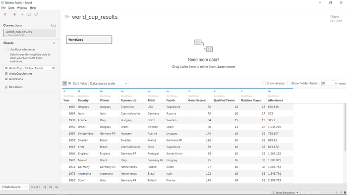
It should now look like this ^
You will see some basic data on the history of the World Cup.
Now click on Sheet 1 which is the small tab on the bottom panel of buttons.
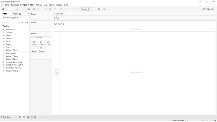
Get used to seeing this screen lol, because you will be seeing it quite a bit from here onwards.
Now you see here there are an array of buttons, functions and options.
So let’s get started with making a basic scatterplot.
On the left side, under the Tables panel, you will see various names of fields that are discrete in nature or continuous. Discrete values have blue field pills and continuous values have green field pills, as you will observe.
Now let’s try something simple.
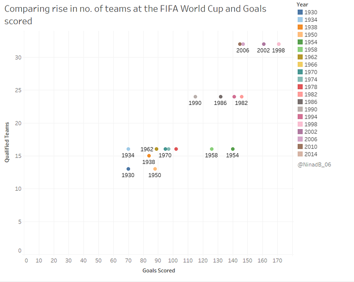
In the history of the World Cup, did increase in the number of teams qualified also lead to an increase in goals scored?
Drag Goals scored onto the box for Columns above and Qualified teams onto the rows box.
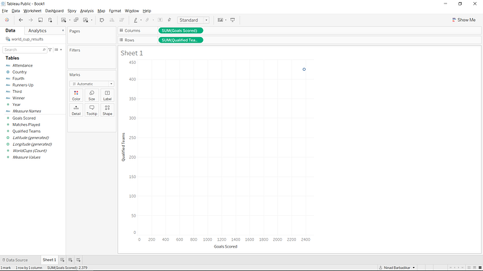
Seeing this and confused? Don’t worry, this is only because Tableau has aggregated/ summed up all the measures in the respective fields and presented a scatter-plot for the same.
To change this, click on Analysis in the topmost toolbar beside Story.
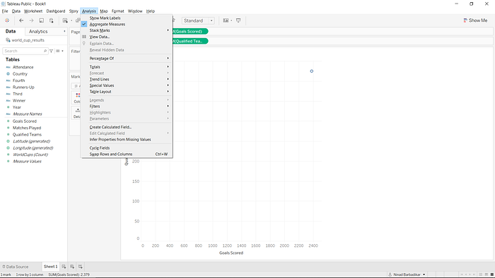
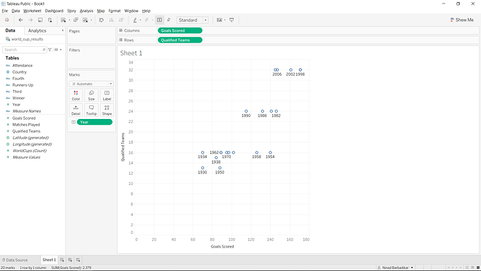
Now uncheck aggregate measures and you will see data points representing each of the years the World Cup was played and the respective goals scored and the number of qualified teams.
At first glance, it’s all just a bunch of circles really, how can we improve this? We improve it by labelling each of the dots.
Now what you are supposed to do, is drag Year onto Label under the Marks section.
This is how your viz now looks —
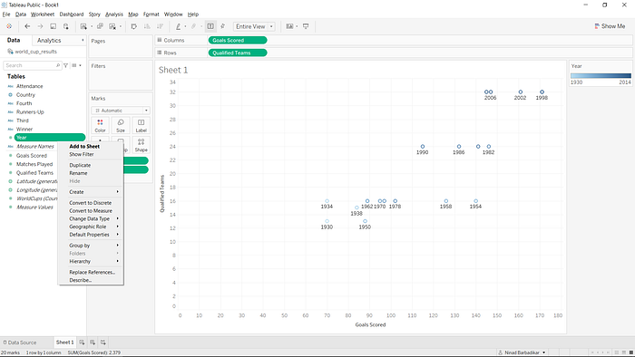
Still looks a little busy, doesn’t it? Let’s create some space.
You see the drop-down menu above the column box that shows Standard?
Click on that and select Entire View.
Now you can see each of the years clearly and for the most part, the labels do not overlap.
Still looks a bit dull, doesn’t it? Let’s colour it up a little.
Once again, drag the Year pill onto Color in the Marks section.

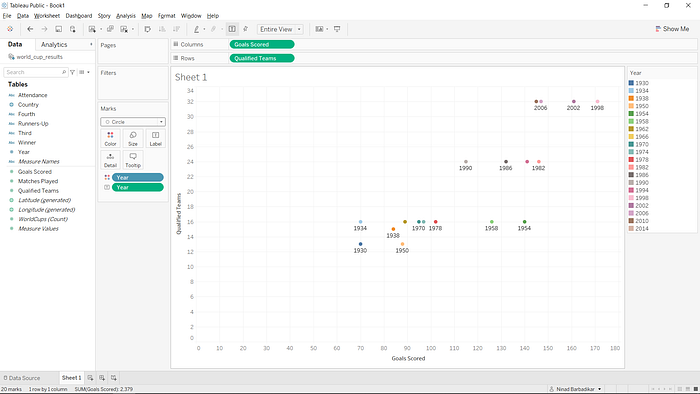
You will see this now.
But why are the colours a gradient? Shouldn’t each year have a separate colour? This is happening because Tableau assumes the Year field to be a measure (continuous value)
Let’s fix that.
Right-click on the Year field.
Now click on convert to discrete. You will notice that the pill is now blue in colour and not green, as it was before, this is because Tableau has listened to your instruction and converted it to a discrete field.
Now drag Year onto the Color box again and see the colours change.
Each year has a different colour that you can see in the colours legend on the right-hand side.
Click on the drop-down menu above Color, Size and label and instead of Automatic, select Circle.
Your viz now looks like this.
Now, let’s bring this to fruition.
Beside Sheet 1 on the bottom panel, there are options to create a new worksheet or a new dashboard, click on new dashboard.
You will see a new dashboard generated that’s empty because you are yet to drop your worksheet onto it.
Dashboards in Tableau are essentially a neat assembly of your worksheets.
Adjust the size by changing it from range to fixed size and change it from custom to desktop browser dimensions. (1000x800)
Drag your sheet (sheet1) onto the dashboard.

This is how your dashboard currently looks like.
To edit the title and replace Sheet 1 at the top, just right click on the area near Sheet 1 and you should see Edit Title.
Change it to what you feel would be apt.
Some year labels for the dots won’t be visible at first glance, but not to worry we’ll deal with that in a future guide blog.
Now naturally you want to include your Twitter @, so the easiest way to do that is to double click on Text under Objects.
A dialogue box will appear before you where you type your Twitter handle. You can modify the font, color and size of text in the dialogue box for all of the text elements on Tableau.
And that’s it! Your very first scatter-plot is ready to go out!
It’s pretty basic but ultimately, when you get started, it’s important to take baby steps.
Now to upload this dashboard online, since there is no option to export the dashboard as an image, simply just take a screenshot and crop out the unnecessary stuff. On Windows, the easiest way is to press the Windows Key +PrtScr function key together.
This is the end of lesson 1 on Tableau Tunnel.
I hope you’ve found this useful in getting started with Tableau. I will jump straight into other visualisations in future articles, but I took the time to explain each bit in this one because it’s important.
If you do work with this data set and end up sharing on social media please do tag me as well and as always I’m available to help on DMs or you can reach me at ninad066@gmail.com with any troubles you have.
Until next time, happy vizzing!
Stay safe and be well!